NEA BLOG
ALMA VOLAVOLA
Fashion Magazine Websites
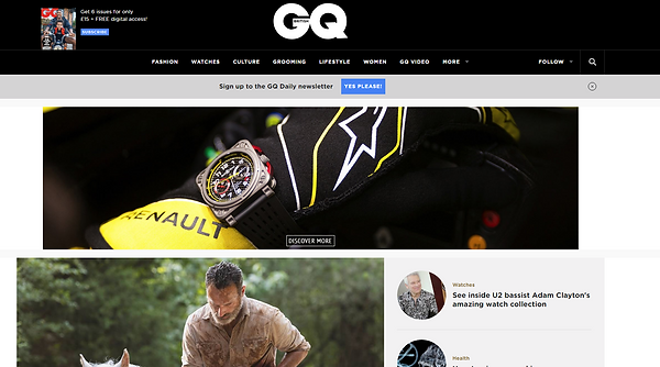
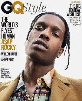
When comparing both magazine issue and the website the clear similarities is the colour style they use for both and the font for the magazine with they use on the website. On the magazine and website it has the same slick font however it does have different colours and is placed differently compared to the website title. For example the Q on the magazine cover is placed slightly over the 'G'. However the font is the same which is created to make audiences more recognisable of their title.
This also shows there is synergy between the website and magazine. The website and magazine also has simple but classy looking colours such as black and grey which can also be seen to other people as quite plain looking colours. The colour black can be associated with power, strength and authority which is quite powerful in its own way as the magazine is focusing on men. However in my magazine I plan to make lighter colours to portray the Youthfulness of my target demographic. The colour white is associated with meanings of perfection which the magazine strive to make there website and magazine look.